Table Of Contents
- Start with your business needs, not the design
- Choose the platform before you choose the template
- Check the design fit and how much you can customize it
- Look for mobile performance, SEO basics, and speed
- Know exactly what is included before you pay
- Signs a template may cause problems later
- Final thoughts
- FAQs
The biggest mistake I see is simple, people buy a template because it looks pretty in the demo. Then they open it, start swapping in their content, and realize it doesn’t fit their business, their platform, or their skill level.
A good website template should save you time. It should not turn into a puzzle with missing pieces.
If you know what to check before you buy, you’ll save money, skip a lot of frustration, and end up with a site you can use.
Start with your business needs, not the design
A website template is a floor plan. If the rooms are wrong, the paint color won’t fix it.
Before you look at fonts, photos, or layout style, get clear on what the site needs to do. Are you booking clients, selling products, growing a list, or sharing content? That answer should guide the template.
What pages do you really need?
Some businesses only need a few core pages, home, about, services, and contact. Others need more room, like a blog, a shop, a portfolio, FAQs, or a booking page.
Buying a 12-page template when you’ll use four pages is wasted money and extra setup. Going too small causes problems too. If you plan to publish content or sell later, you don’t want to rebuild in six months.
One-page or multi-page, which fits better?
A one-page site can work well for a simple offer, a personal brand, an event, or a short-term launch. It’s fast to set up and easy to guide people through one action.
A multi-page site usually makes more sense for service businesses, shops, and brands that want search traffic. It gives you more room for SEO, more space to build trust, and clearer paths for different offers.
Need help deciding? Read more in this article: One-Page Website vs Multi-Page Website: Which Fits Your Business Right Now?
Match the template to your business type
A coach doesn’t need the same layout as a photographer. A travel advisor doesn’t need the same page flow as a candle shop.
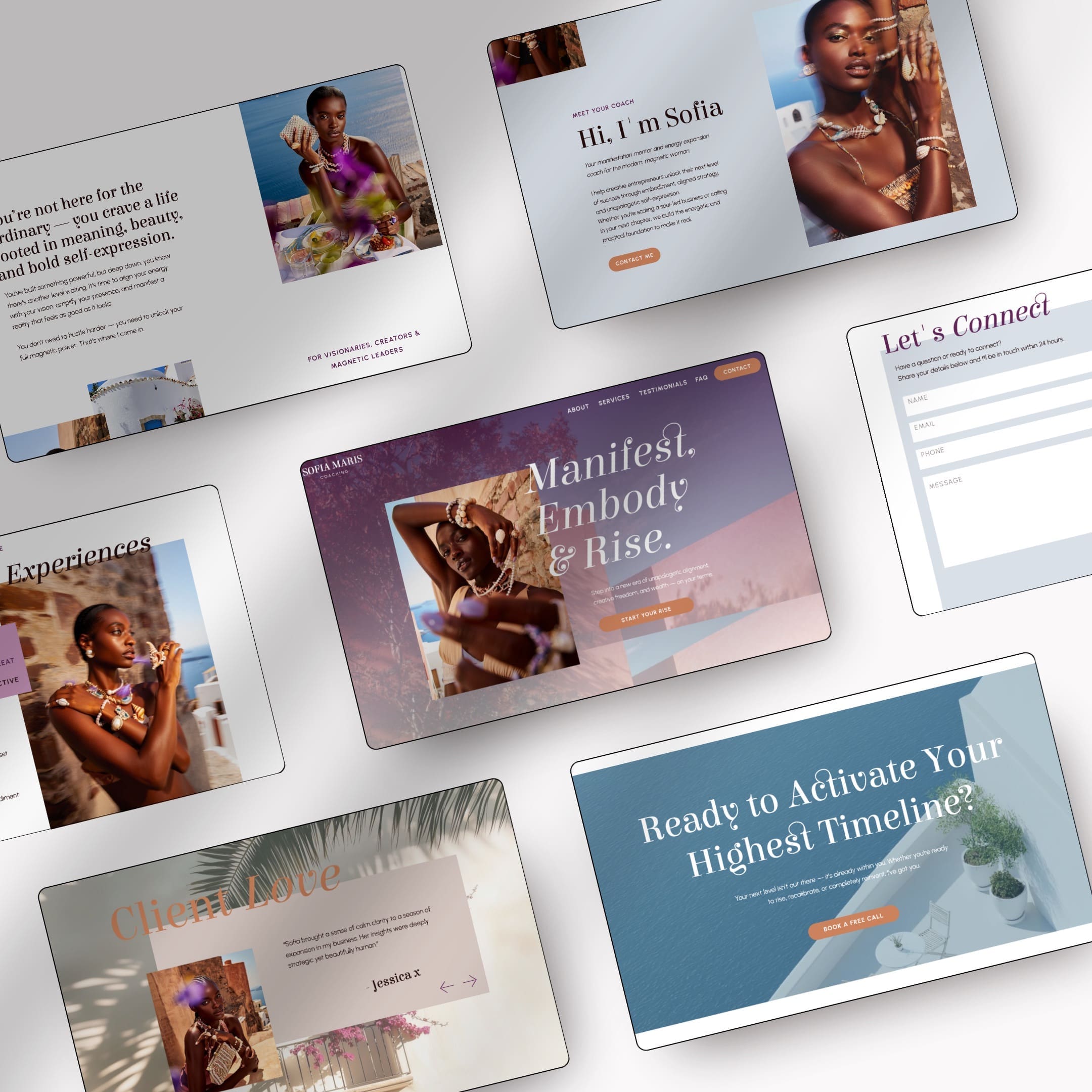
If you’re a holistic coach, business coach, spiritual coach, travel advisor, or another service-based brand, a niche template often works better than a generic one. The right sections are already there, testimonials, offers, FAQs, lead magnets, pricing, or inquiry forms. That usually means better conversions with less editing.
Choose the platform before you choose the template
This is where a lot of buyers go wrong. They fall in love with a design, then realize it’s built on a platform they don’t want to use.
Your template and your platform need to fit each other. If they don’t, the site will feel hard to manage from day one.
Showit vs Squarespace, what each one is best for
If you’re choosing between these two, keep it practical.
| Platform | Best for | Editing style | Watch for |
|---|---|---|---|
| Showit | Custom layouts, design freedom, brand-heavy sites | Drag-and-drop, more visual control | More decisions, more setup |
| Squarespace | Beginners, simple service sites, all-in-one setup | More guided, more structured | Less layout freedom |
Showit is great when you want more creative control and a custom-feeling look without custom development. It’s also a strong choice if you care a lot about layout details or want easier template swapping later. Squarespace is a better fit if you want fewer moving parts and a simpler setup experience.
If you’re torn, take my Showit vs Squarespace quiz before you buy anything. Picking the platform first will save you from shopping twice.
Think about your comfort level with tech
Some people want full drag-and-drop freedom. Others want a system that keeps them from breaking the layout.
Be honest here. If you don’t want to tweak mobile layouts, manage lots of design settings, or learn a new builder, pick the platform that feels easier. The best template is the one you’ll finish.
Make sure the template works with your long-term plan
Think past launch week. Will you want a blog later? A shop? A booking system? More service pages? A lead magnet funnel?
A site should have room to grow with you. If your business is expanding, choose a template and platform that won’t feel too small six months from now.
Check the design fit and how much you can customize it
This part matters more than people think. A template can be beautiful and still feel wrong for your brand. You don’t need the trendiest design. You need one that feels like your business.
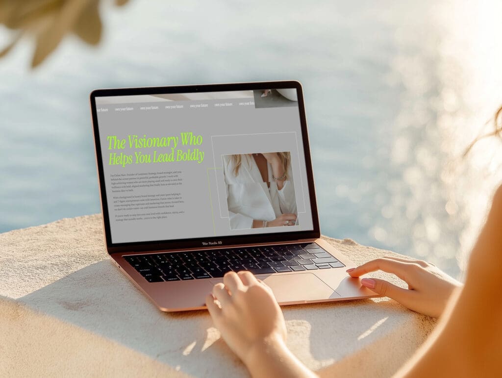
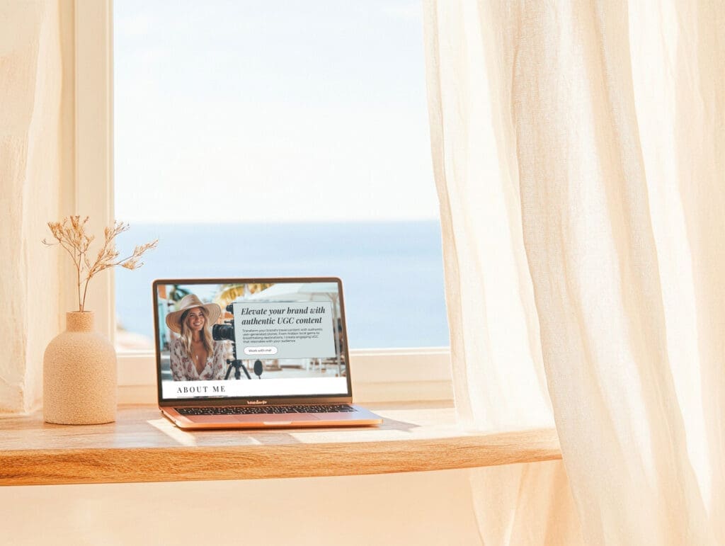
Does the style match your brand vibe?
Look past the stock photos. Ask how the template feels.
Is it minimal, bold, soft, editorial, playful, modern, feminine, moody? Then ask if that matches how you want clients to see you. A polished template that feels too trendy or too polished for your audience can create distance instead of trust.
Can you change fonts, colors, and images easily?
You should be able to replace the basics without hiring a designer. Fonts, colors, images, button styles, and headline copy should all be easy to update.
Some templates are flexible in real life. Others only look flexible in the demo because the sample branding does all the heavy lifting. Check screenshots, feature notes, and tutorials before you buy.
How much can you edit before the layout starts to fall apart?
This is the hidden issue. Some templates look great only if you use them almost exactly as shown.
Watch for rigid sections, hard-to-duplicate pages, fixed image crops, or layouts that depend on short copy. If your content style is wordier, or your brand uses different kinds of images, the design still needs to hold up.
Look for mobile performance, SEO basics, and speed
A desktop demo can be gorgeous and still flop on a phone. That’s a problem, because a big chunk of your visitors will see your site on mobile first.
The template also needs clean structure and reasonable speed. If it feels clunky, people leave.
Why mobile design can make or break your site
On mobile, small problems get loud fast. Tiny text, awkward spacing, cropped images, or hard-to-tap buttons can make the whole site feel off.
Some platforms give you separate mobile editing control. Others handle responsiveness more automatically. Neither is better for everyone. What matters is that the mobile version looks intentional, not like an afterthought.
How to test the demo on your phone before buying
Open the live demo on your phone, not just your laptop. Then use it like a real visitor.
Tap the menu. Scroll every page. Check button size, text readability, image cropping, form fields, and how long sections feel. If you get annoyed in 30 seconds, your visitors will too.
SEO-friendly structure you should not ignore
You don’t need advanced SEO to shop for a template. You do need the basics.
Look for clean heading structure, image alt text fields, meta title and description settings, blog support if content matters to your plan, and simple page layouts that make sense. Heavy effects, messy structure, and giant image files can hurt both speed and search visibility.
Know exactly what is included before you pay
Template listings can look generous on the cover image and thin in the actual files. Read the details before you check out.
You’re not only buying a design. You’re buying the pages, the setup help, and the overall experience.
How many pages, sections, and bonuses are included?
The listing should tell you what you’re getting. How many pages are included? Are there extra sections? Does it come with graphics, icons, stock photos, or Canva files?
Compare value, not only the prettiest mockup. A cheaper template with no extras can cost more time later.
Look for setup help, guides, and walkthroughs
Good documentation makes a huge difference, especially if you’re not techy. A launch guide, video tutorial, or clear step-by-step walkthrough can cut setup time in half.
Check support, updates, and refund terms
Find out what happens after purchase. Is there email support? A help center? A short support window? Any future updates?
Also read the refund policy. Digital products often have limited or no refunds at all, which is normal, but the terms should be easy to find and easy to understand.
Signs a template may cause problems later
A few red flags are easy to miss when the mockup photos look nice:
- There is no live demo to test.
- The description is vague about pages, features, or platform.
- Support details are missing.
- Reviews are thin or nonexistent.
- Extra setup costs show up after purchase.
- The design already looks dated.
None of these automatically mean “don’t buy,” but they should make you slow down.
Why a beautiful template can still be the wrong choice
Buying a website template just because it looks pretty or aesthetic isn’t the best move. The right template should fit your business goals, your platform, your content, your brand, and your comfort level. If even one of those is out of sync, the design can turn into dead weight fast.
Final thoughts
Before you buy a website template, check the bones first, business needs, platform, customization, mobile experience, SEO basics, included assets, support, and terms. That’s what tells you whether a template will feel easy or frustrating once the demo images are gone.
The best choice usually isn’t the flashiest one. It’s the one that fits your real business and the way you work.
If you’re ready for the next steps, take a Showit vs Squarespace quiz or browse all website templates.
FAQs
How do I know if a website template fits my business?
Start with what your site needs to do, not how it looks in the demo. If you need booking, sales, content, or lead generation, the template should already support that structure with the right pages and sections. A pretty layout that doesn’t fit your offers or process will just create extra work later.
Should I pick my platform before I pick a template?
Yes, because the platform shapes how easy the site is to manage. A template built for Showit won’t feel the same as one built for Squarespace, and forcing the wrong fit usually leads to frustration fast. If you’re torn, choose the platform first, then shop templates made for that system.
What should I test in a template demo before buying?
Open the demo on your phone and use it like a real visitor. Check the menu, button size, text readability, image crops, spacing, and how the forms feel on mobile. If the demo feels awkward in a minute or two, the finished site probably will too.
Do I need a one-page or multi-page template?
A one-page template works well for a simple offer, an event, a personal brand, or a short launch. A multi-page template is a better fit for service businesses, shops, and brands that want more room for SEO, trust building, and different offers. If you plan to grow, pick the structure that gives you space to expand later.
This post may contain affiliate links. If you make a purchase through these links, I may earn a small commission at no extra cost to you.


