
Table Of Contents
Getting someone to trust a travel agency online is harder than getting them to admire a pretty homepage. You’re asking them to hand over money, time, and a trip they’ve probably been thinking about for months.
That’s why a good travel agency website can’t stop at looking polished. It has to be clear, fast, mobile-friendly, and built to move people from “maybe” to “tell me more.”
If you’re launching a new site or fixing one that looks nice but doesn’t convert, this framework will help you tighten the parts that matter most.
Start with a homepage that makes your offer clear in seconds
Your homepage is the front desk of your business. People land there, scan fast, and decide if they’re in the right place.
If the first screen feels vague, crowded, or too clever, they’ll bounce. You don’t have long to earn attention, so clarity has to come first.
Say who you help, what you plan, and why it matters
The first thing visitors should understand is simple: who you help, what kind of trips you plan, and why working with you is better than figuring it all out alone.
That doesn’t mean writing a paragraph about your passion for travel. It means using plain language that instantly filters the right people in. Think: family vacations with less stress, luxury escapes with concierge-level planning, honeymoons that feel personal, group travel without the chaos.
A strong homepage headline usually answers three questions at once:
- Who is this for?
- What do you help with?
- Why should I care?
For example, “Custom Europe itineraries for busy families who want the trip handled well” is clearer than “Creating unforgettable travel experiences.” One sounds useful. The other could belong to almost anyone.
If the first screen tries to say everything, it usually says nothing. Visitors don’t need your whole story yet. They need a fast sense that they’ve found the right agency.
Use one strong call to action above the fold
Once the message is clear, give people one obvious next step. Not three. Not six.
A homepage with “Contact Us,” “Learn More,” “Browse Services,” “Read the Blog,” and “Shop Now” all competing at the top makes people hesitate. A single button like “Get a Quote,” “Plan My Trip,” or “Book a Consultation” reduces friction because it removes the need to choose.
Make that button easy to spot. Use contrast, give it breathing room, and place it high on the page. Then repeat it lower down, after you’ve added more trust and context.
This matters even more in travel because people often browse quickly. They’re comparing options, saving ideas, and checking sites between other tasks. If they have to stop and think too hard about what to do next, they won’t do anything.
Build trust fast with proof that feels real
Travel is a high-trust sale. People aren’t buying a $12 planner. They’re booking something expensive, emotional, and time-sensitive.
Your site has to answer the question sitting in the back of every visitor’s mind: “Can I trust you with this trip?”
Place testimonials, reviews, and client photos where people will actually see them
Social proof works best when it appears near moments of action. Put it close to service descriptions, quote buttons, and inquiry forms, not buried at the bottom of a page no one reaches.
Short testimonials often do more work than long ones. A sentence like “She planned our Italy honeymoon down to the transfers, and it was flawless” is stronger than generic praise like “Great service!”
The best proof feels specific. Use:
- short client quotes
- star ratings, if you have them
- photos from real trips
- a quick case-study style story
- destination-specific feedback on related pages
If you offer several types of trips, match the proof to the service. A family vacation testimonial belongs near the family travel section. A luxury trip review belongs on the luxury page. Relevance helps people picture themselves in the story.
When visitors can see real outcomes, trust stops feeling abstract.
Add the details that make your business feel established
Trust isn’t built by one big gesture. It’s built by many small cues.
Clear contact details matter. So does an about page with your photo, your team, and a short explanation of how you work. Add your business email, service area, and response expectations. If you have certifications, memberships, awards, or preferred supplier relationships, show them where they fit naturally.
Secure payment notes also help, especially if you collect deposits online. So do partner logos, media features, and a clear process page that explains what happens after someone inquires.
The goal isn’t to pile on badges. It’s to reduce doubt.
A site feels safer when it looks like a real business with real systems behind it. That feeling matters more than people admit.
Make it easy to explore services and choose the right trip
A strong website doesn’t make people hunt. It guides them.
Visitors should be able to move from curiosity to inquiry without feeling lost, overwhelmed, or forced to click through a maze.
Organize your pages around the trips people want to book
Your navigation should mirror the way clients think. They aren’t looking for clever page names. They’re looking for answers.
That usually means clear pages for your services, destinations, FAQs, about, blog, and contact. If you offer different trip types, give them their own pages. A honeymoon page should speak to honeymoon clients. A group travel page should speak to group organizers. Each page should answer one main question and lead to one next step.
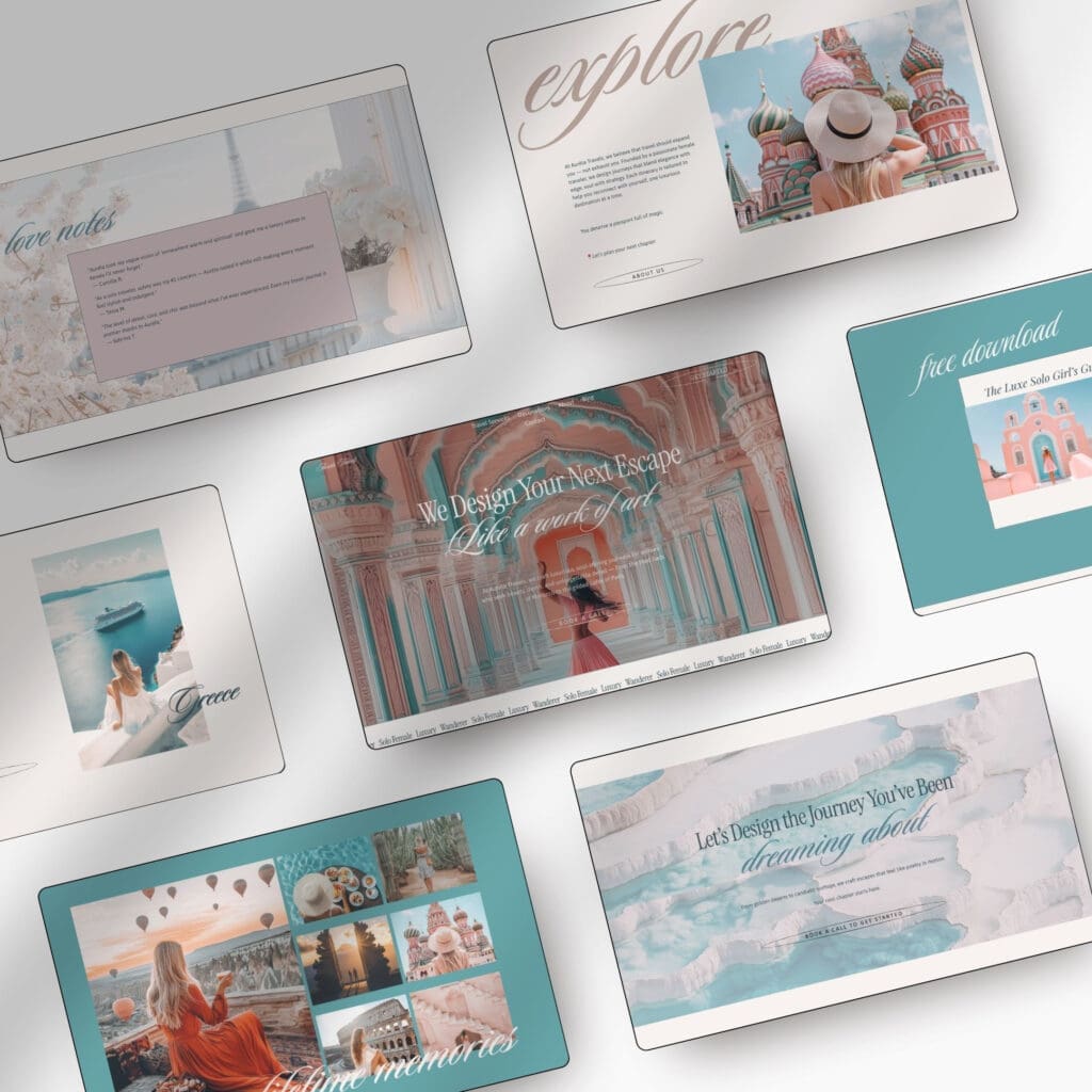
This is also where a strategic template can save a lot of time. A Squarespace website template built for travel agencies gives you the structure upfront, so you’re not piecing together your site page by page and hoping it works.
A good travel template should give you more than a nice layout. It should give you the bones of a site that is built to convert. For example, my Squarespace template for travel agencies includes:
- 10+ fully customizable pages, including Home, About, Travel Services, Destinations, Blog, FAQ, Contact, Freebie, Link in Bio, and legal pages
- a launch hub with step-by-step training, roadmaps, checklists, and 60-day email support
- a marketing toolkit with blog assets, email marketing resources, social media templates, logos, and brand boards
- Squarespace Circle perks like a 6-month free trial and 20% off the first year on an annual plan
That kind of setup is useful for new travel agents and established agencies alike. You launch faster, but the site still feels polished, strategic, and custom to your brand.
Use visuals and content that help people picture the experience
Travel is emotional. People don’t only buy logistics, they buy the feeling of the trip.
So yes, your visuals matter. But not in a random “fill the page with pretty photos” kind of way. The images on your site should support the offer. Show the kinds of destinations you plan, the level of experience clients can expect, and the mood of your brand.
Pair those visuals with copy that talks about outcomes, not fluff. Instead of “bespoke itineraries designed for memorable journeys,” say what the client gets: expert planning, less stress, better-fit hotels, thoughtful details, and a trip that fits their style.
Good travel content helps people imagine themselves there. Great travel content makes the next step feel easy.
Design for speed, mobile use, and low-friction inquiries
A beautiful site still fails if it loads slowly or fights the user.
A lot of travel research starts on a phone, on the couch, in line, between meetings. In 2026, the best-performing travel sites still win on the basics: fast pages, simple layouts, and easy actions on mobile.
Keep pages fast and the layout simple
Page speed isn’t only a technical issue. It’s a trust issue.
If your homepage takes too long to load, the visitor may never even see your offer. Large image files are one of the biggest culprits on travel websites, which makes sense because travel brands rely so heavily on visuals. Compress your images, limit heavy animations, and cut anything decorative that slows the page down without helping conversion.
If you can get key pages loading in about two seconds, you’re in a much better place.
Keep layouts clean, too. Too many sections, sliders, pop-ups, and moving parts make a site feel harder to use. A clear structure with room to breathe almost always works better than a homepage trying to show every service, every destination, and every thought you’ve ever had.
Make forms, menus, and buttons easy to use on any screen
If your inquiry form feels like homework, people will leave it half-finished.
Ask for the information you need to start the conversation, not every detail you might want later. Name, email, trip type, rough timing, and a short message is often enough. You can gather more once the lead is warm.
The same goes for navigation. Keep menus short. Use clear labels. Make buttons large enough to tap without zooming in. Don’t hide important pages inside dropdowns that are awkward on mobile.
A good mobile experience feels obvious. The user shouldn’t have to think about where to click, what a button means, or how to contact you. When your site removes friction, more people follow through.
Conclusion
Visitors decide fast. If your travel agency website is unclear, slow, or thin on trust, they’ll keep looking.
The sites that convert don’t always have the flashiest design. They have the clearest message, the strongest proof, and the easiest path to inquire. That’s what turns interest into action.
Take a hard look at your current site. Tighten the weak spots, simplify the path, and if you want a faster launch, start with a strategic template that already has the right structure built in: Squarespace Template for Travel Agencies.
FAQs
What should a travel agency homepage say right away?
A strong homepage tells visitors who you help, what kind of trips you plan, and why they should keep reading. Plain language works better than vague lines about “unforgettable experiences” because people need to know, fast, if they’re in the right place. If the first screen is clear, focused, and easy to scan, you’re already ahead.
Where should testimonials and reviews go on a travel agency website?
Put them near the moments that matter, like service descriptions, inquiry buttons, and forms. That way, visitors see proof before they have to make a decision. Short, specific feedback usually works best, especially when it matches the trip type someone is browsing.
How many call-to-action buttons should a travel agency homepage have?
One main call to action is usually enough, especially above the fold. Too many buttons, like “Contact Us,” “Read More,” and “Browse Services” all competing at once, make people hesitate. A clear option like “Get a Quote” or “Plan My Trip” gives them a next step without forcing a choice.
What makes a travel agency website feel trustworthy?
A trustworthy site feels real, not polished for the sake of it. Clear contact details, an about page with a photo, proof like certifications or partner logos, and a process page that explains what happens next all help reduce doubt. People want to know there’s a real business behind the pretty photos.
This post may contain affiliate links. If you make a purchase through these links, I may earn a small commission at no extra cost to you.


