Table Of Contents
Many gym, studio, and personal trainer websites look polished, but they still don’t turn visitors into leads or members. They act like online brochures when they should work like a full-time sales rep.
If someone lands on your site and can’t tell what you offer, who it’s for, or what to do next, you lose them fast. That’s true whether you run a local gym, teach small-group classes, or sell one-on-one coaching online.
A high converting fitness website wins with clarity, trust, and a simple path forward. That means strong messaging, one clear call to action, easy-to-read service pages, real proof, a smooth mobile experience, and lead capture that doesn’t feel like work. Start at the top, because your homepage sets the tone for everything that follows.
Start with a clear message and one next step
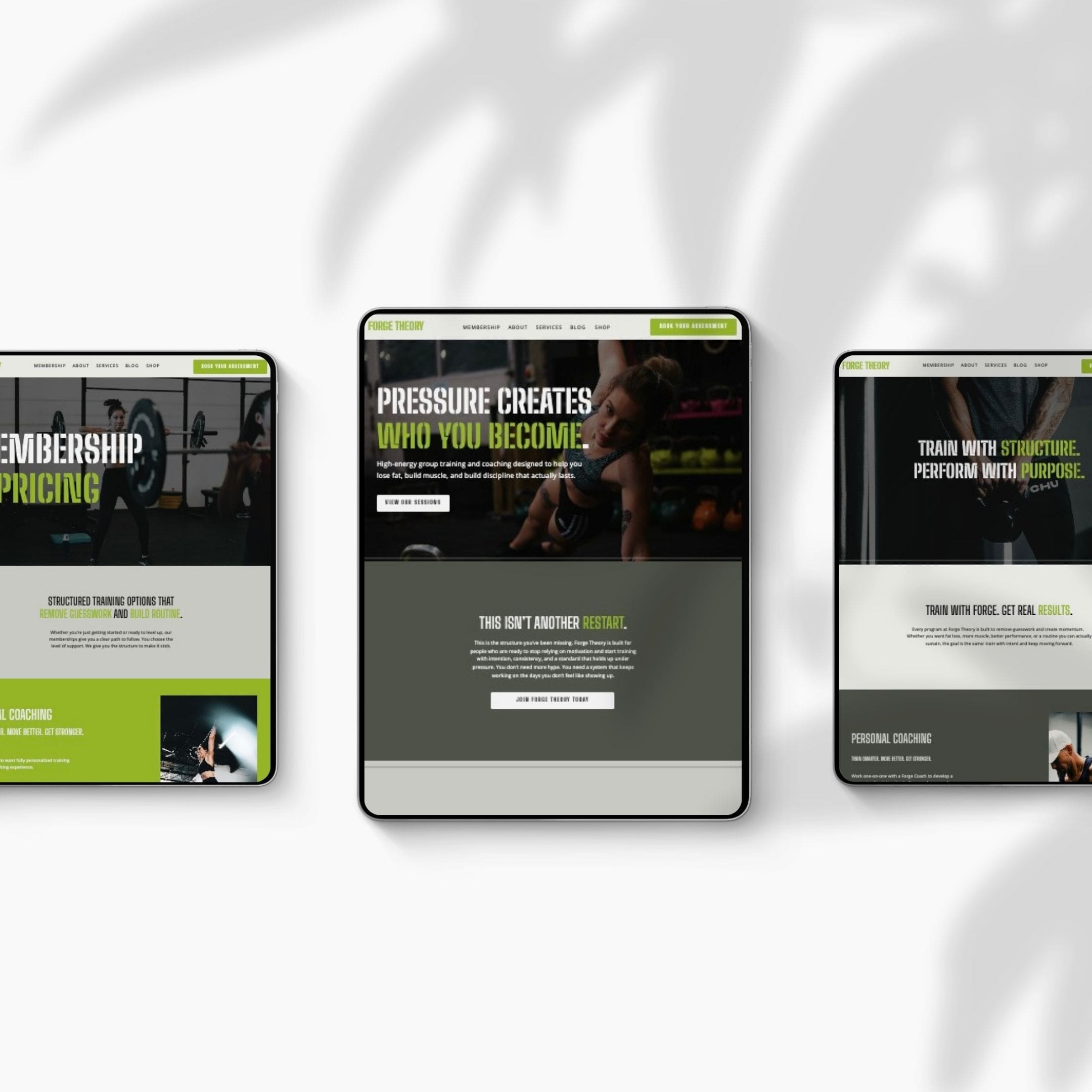
The top of your homepage does most of the heavy lifting. In a few seconds, visitors decide whether to stay, scroll, or leave. That’s why a high converting fitness website starts with clarity, not clever copy.
Think of this section like your front desk. If people walk in and no one tells them where to go, they hesitate. Your website creates that same feeling when the headline is vague or the buttons compete for attention.
Write a headline that says who you help and what result you offer
“Welcome to our gym” says almost nothing. It doesn’t tell people if you help beginners, athletes, busy parents, or women over 40. It also doesn’t tell them what kind of result they can expect.
A better headline does three jobs at once. It says who you help, what you offer, and what outcome matters. For example, “Strength Training for Busy Professionals in Denver” is far stronger than “Train Better.” So is “Small-Group Coaching for Women Who Want to Build Strength and Energy.”
Local fit matters too. If you run a city-based gym or studio, use your location in the headline or subhead. That helps people feel, right away, that they found the right place.
Use one strong call to action above the fold
Once the message is clear, give people one main move to make. Not three. Not five.
If the page shows “Join Now,” “Contact Us,” “Learn More,” and “View Memberships” all at once, the visitor has to choose. That slows action. A single primary button works better because it removes friction.
“Book a Free Trial,” “Join Now,” and “View Class Schedule” are all strong options. Pick the one that matches your sales process. Then place it high on the page so it appears right away on desktop and mobile. The first screen should answer two things fast: “Is this for me?” and “What do I do next?”
Make your services and pricing easy to understand
Confusion costs leads. If people can’t figure out what you offer in under a minute, they often leave and compare you with someone else.
That doesn’t mean you need long explanations. It means your services should be organized in a way people can scan. They should also know, at least in broad terms, what it may cost.
Show each program in simple blocks people can scan
Most fitness businesses offer more than one path. You may have personal training, group classes, online coaching, hybrid memberships, or specialty offers like mobility, recovery, menopause support, or youth training.
Put each program in its own clean block. Give it a short description, say who it’s for, and add a direct button to learn more or book. Visitors shouldn’t have to read a wall of text to understand the difference between your offers.
This is where many sites lose people. They pile every service onto one page with no structure. A better setup feels more like signs in a well-run studio. People can find the right room fast.
Short copy works best here. Name the offer, explain the fit, and point to the next step. That’s enough.
Reduce friction with honest pricing or a clear starting range
Many visitors want pricing before they contact you. If they can’t find it, they may assume you’re expensive or hard to buy from.
You don’t always need to post every rate. Still, you should give people a real sense of the investment. A starting price, package range, or clear membership tier can build trust and help qualify leads.
For example, a page might say personal training starts at a certain rate per session, or group memberships start at a certain monthly price. If your pricing depends on custom plans, say that and explain why. Then offer a free intro session, consultation, or trial class.
If you use no-contract terms, trial offers, or beginner-friendly onboarding, say so. Small details like that lower resistance because they make the first step feel safer.
Build trust fast with proof, photos, and a real brand feel
A visitor can like your offer and still hold back. Maybe they wonder if your gym feels welcoming. Maybe they aren’t sure your trainers know what they’re doing. Maybe your site looks too generic to trust.
That’s where proof matters. A strong gym website design doesn’t feel like a template filled with placeholders. It feels real, current, and tied to an actual experience.
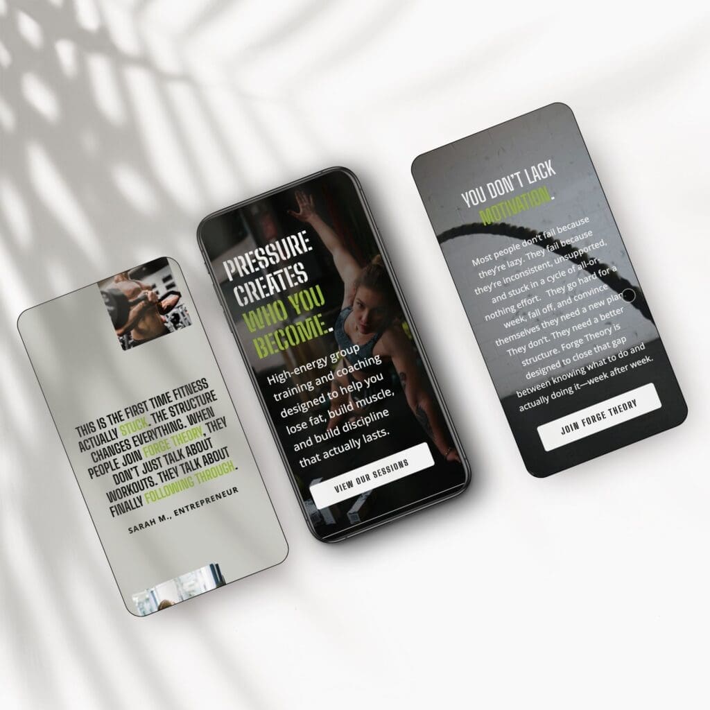
Use testimonials and results that sound specific and believable
Generic praise is weak. “Great gym, amazing staff” won’t move many people. Specific proof does.
A stronger testimonial mentions a real outcome, a time frame, or a starting point. Maybe a client says they lost 20 pounds, built confidence after having a baby, or finally felt comfortable in a gym for the first time. That kind of detail feels human.
You can also support trust with review counts, years in business, certifications, and trainer credentials. If your coaches have specialties, put them on the page. If you’ve trained beginners for years, say that clearly.
Real names help. Real photos help more, as long as you have permission. Before-and-after stories can work well too when they feel honest and not overproduced.
Choose real photos and short videos over generic stock images
Fitness is personal. People want to see your space, your coaches, and the kind of community you’ve built. Stock photos usually miss that. They make your brand feel borrowed.
Clean phone photos often work better than fake-looking stock shots. Show the entrance, training floor, class setup, trainers in action, and members who reflect the people you want to attract.
Short video clips help even more. In 2026, fitness sites that convert well often use quick, authentic videos to show class energy, coaching style, and member wins. A 10-second clip of a session tells a fuller story than a paragraph ever could.
User-generated content can help too. A member selfie, a progress post, or a short celebration clip gives your site a lived-in feel. That kind of content builds trust because it looks like real life, not an ad.
Remove objections with a smooth user experience on every page
Even a great offer loses leads when the site is hard to use. Slow pages, cluttered menus, and buried contact details create small moments of doubt. Those moments add up.
A strong website reduces hesitation. It helps people move from interest to action without making them work for it.
Keep navigation, mobile design, and page speed simple
Most visitors will find you on their phones. For fitness brands, mobile is often the first tour, the first sales call, and the first booking touchpoint all at once.
So keep the menu simple. Home, About, Services, Pricing, Blog, Contact, and Book Now are usually enough. Anything extra should earn its place.
Pages should load fast. Buttons should be easy to tap. Text should stay readable without pinching or zooming. If your class schedule, pricing, or booking tool feels awkward on mobile, conversions will drop.
Mobile-first also means thinking about the first thumb scroll. Your headline, image, and call to action should still make sense on a small screen. A great desktop design can still fail if the phone version feels cramped.
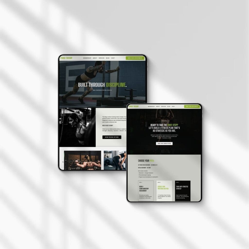
Answer common questions and make it easy to get in touch
FAQs do quiet but important work. They remove small objections before those objections turn into exits.
Answer the things new clients worry about. Are beginners welcome? What should they wear? Is parking easy? Do you offer showers? How do cancellations work? Do you have online or hybrid options? These aren’t minor details when someone feels nervous about starting.
Helpful blog posts support this too. A short article on “What to Expect at Your First Personal Training Session” or “How to Choose Between Group Training and One-on-One Coaching” builds trust and can bring in search traffic over time.
Then make contact simple. Your contact page should include a short form, phone number, email, address, hours, map, and links to your social profiles or booking tools. Keep the form short. If you ask for too much, fewer people will finish it.
When every page answers doubts and points toward one next action, your site stops feeling like a brochure and starts working like staff.
A fitness website doesn’t need flashy effects to convert.
It needs a clear message, a strong CTA, easy-to-scan services, honest pricing, real proof, and a mobile-friendly path to contact or booking.
That’s what turns a nice-looking site into one that earns leads. It feels trustworthy, simple, and easy to act on. People know where they fit, what to expect, and how to take the next step.
If you want that structure without starting from scratch, a Showit fitness website template built with these sections already in place can save time and remove guesswork. For gym owners, fitness coaches, and personal trainers, it’s a faster way to launch a site that looks good and works hard. View the template, see how the pages flow, and get started with a stronger foundation.
FAQs
What makes a fitness website “high converting”?
A high converting fitness website turns visitors into leads, bookings, or members at a strong rate. It does that with a clear headline, one main call to action, easy-to-scan services, honest pricing, real proof, and a fast mobile experience. The design matters, but the structure and messaging do most of the work.
Should I show pricing on my gym or personal trainer website?
In most cases, yes. Visitors want a sense of the investment before they reach out. You don’t have to list every rate, but a starting price, package range, or membership tier helps build trust and filter out poor-fit leads. If your pricing is custom, say so and point people to a free intro session or consultation.
How many pages does a fitness website actually need?
Most fitness businesses do well with a focused set of pages: Home, About, Services, Pricing or Membership, Blog, Contact, and a booking page. That covers what visitors need without overwhelming them. Extra pages should earn their spot by serving a clear purpose, like a specialty program, success stories, or a free guide opt-in.
This post may contain affiliate links. If you make a purchase through these links, I may earn a small commission at no extra cost to you.


