Table Of Contents
- Start with a clear brand direction before you design anything
- Build your site on a platform that makes professionalism easier
- Create a homepage that looks polished and guides people well
- Make your site easy to use on every screen
- Add the trust-building pages and details people expect
- Conclusion
- Ready to launch a travel blog website you’re proud of?
- FAQs
People make decisions fast. On a travel blog, they make them even faster.
If your site feels cluttered, slow, or hard to follow, even strong photos can get passed over. A polished travel blog is not about flashy effects. It’s about clarity, consistency, and trust, especially on mobile, where most visitors will see it first.
If you’re learning how to create a travel blog website that feels polished from day one, the answer is simpler than it seems. Start with a clear direction, choose a platform that works for you, and build a site people can understand in seconds.
Start with a clear brand direction before you design anything
The best travel blog websites don’t feel random. They feel focused.
That’s what makes them look professional. Not the prettiest font. Not the fanciest homepage. Focus. When readers land on your site, they should get the vibe fast. What kind of travel do you cover? Who is it for? Why should they stay?
Choose your travel niche and content style
You do not need a tiny niche, but you do need a clear lane. Maybe you share solo travel guides, luxury stays, family itineraries, city breaks, van life content, or creator-friendly hotel reviews. Any of those can work. Trying to do all of them at once usually doesn’t.
A clear niche helps every design choice make sense. It shapes your photos, categories, homepage sections, and even the tone of your writing. A family travel site should not feel like a moody boutique hotel portfolio. A UGC creator site should make room for brand work, not only blog posts.
Think about your main content style too. Are you publishing planning-heavy guides, visual trip diaries, hotel reviews, or a mix of blog content and brand partnerships? The answer changes your layout.
Pick a simple visual identity that fits your audience
You don’t need a full brand agency package to look put together. Start with two or three colors, maximum three readable fonts, and a simple logo or wordmark. That’s enough.
The key is repetition. Use the same colors in your buttons, blog graphics, opt-ins, and social links. Keep your fonts consistent across headings, body text, and image overlays. Professional sites repeat themselves on purpose. A polished brand usually looks simple, not busy.
If you’re not sure what fits, let your niche guide you. City guides often look clean and editorial. Luxury travel can carry richer tones and more white space. Adventure travel usually works best with a more grounded, casual feel. Pick a direction, then stick to it.
Build your site on a platform that makes professionalism easier
Some platforms make it easier to keep things clean. That’s not a small detail. When your backend feels chaotic, your front end often does too.
If you want a polished site without a huge learning curve, Squarespace is a strong option for travel bloggers, influencers, and UGC creators. The layouts are clean, mobile-friendly, and easier to manage than a setup that needs constant plugins and fixes.
Use a travel-focused template instead of starting from scratch
Starting with a blank page sounds creative until you’re choosing spacing, page structure, button styles, and mobile layouts by hand. A solid template saves time and avoids that uneven, pieced-together look.
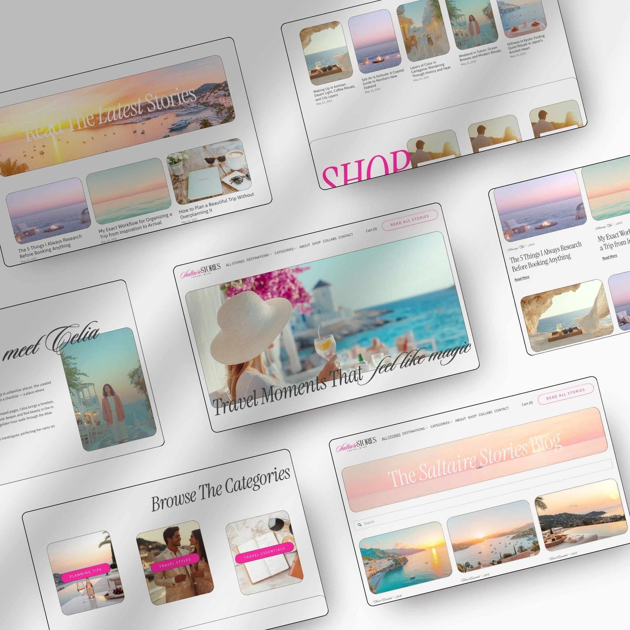
For travel creators, a good Squarespace 7.1 template should give your photos space to shine while keeping the structure simple. It should include a strong homepage, clean blog layout, flexible category pages, and space for the pages you actually need, not just the pretty ones.
A good example is the travel blogger Squarespace template from Orsolya Dobri. It’s built for travel bloggers who want a professional site fast, without losing personality. The design works well for destination guides, travel tips, personal stories, UGC work, freebies, and even a simple shop.
It also comes with more than a homepage and a prayer:
- 10+ customizable pages, including Home, About, Blog, Shop, Freebie, Contact, Link in Bio, 404, Privacy Policy, and Terms
- mobile-responsive layouts that keep your content clean on every screen
- step-by-step trainings, checklists, launch resources, and 60-day email support
- branding tools like logos, brand boards, social templates, a blogging bundle, and an email marketing kit
- Squarespace perks, including a 6-month free trial and 20% off the first year on an annual plan
That kind of setup helps you launch faster and look more established right away.
Make sure the platform supports mobile design and easy edits
Travel creators update their sites often. New posts, new destinations, new brand work, new offers. Your platform should make those edits easy.
Look for drag-and-drop sections, simple font and color controls, and flexible page templates you can reuse. You want a site that can grow with you, not one that turns messy every time you add something new.
If you’re learning how to create a travel blog website for the long run, this matters more than people think. A clean system behind the scenes makes it easier to stay consistent in public.
Create a homepage that looks polished and guides people well
Your homepage is your first handshake. It sets the tone fast.
If someone lands there and can’t tell what you do, who it’s for, or where to click next, the design has already lost. The goal is not to impress people with more stuff. The goal is to orient them.
Lead with a strong hero section and a clear message
The top of your homepage should do three things. Show a strong image, say what your site is about, and give one clear next step.
That intro does not need to be long. In fact, shorter is usually better. Something like “Destination guides and travel tips for first-time Europe trips” is stronger than a vague paragraph about loving adventure. If you also create brand content, say that too. Readers and potential clients should not have to guess.
Then add one clear call to action. Read the blog. Browse destinations. Work with me. Download the free guide. Pick one main move.
Show your best content without crowding the page
After the hero section, feature your strongest content in a clean flow. That might be your top destinations, popular blog posts, recent guides, a featured freebie, or a small section with brand logos or media mentions.
The trick is restraint. Too many homepage sections make the site feel noisy. Too many fonts make it look homemade. Too much text makes people skim past the good parts.
White space is not wasted space. It’s what helps your best content stand out. A polished homepage feels edited. It says, “Here’s what matters most,” and leaves the rest for the menu.
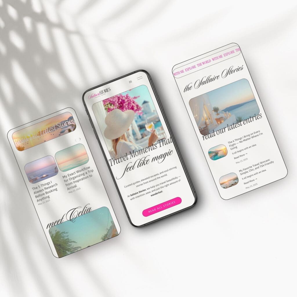
Make your site easy to use on every screen
A site can look beautiful and still feel frustrating. That’s where a lot of travel blogs lose people.
Professional design is not only visual. It’s also functional. Your reader might be on a phone in line at the airport, saving a hotel guide for later. If your menu is clunky or your images take forever to load, the site stops feeling trustworthy.
Keep menus short and categories easy to understand
Navigation should feel obvious. Use labels people already understand, like Destinations, Travel Tips, Itineraries, About, and Contact.
Avoid cute menu names that sound clever but confuse readers. If someone has to stop and think, the menu is not working.
Try to keep your main navigation short. Group similar content under broad categories. Use a category template if your platform supports it, so archive pages stay consistent instead of looking slapped together.
Optimize photos so the site loads fast and still looks beautiful
Travel sites are visual by nature, but big image files can drag everything down. Export web-sized images, compress them before uploading, and keep your image ratios consistent across blog thumbnails and gallery sections.
That small bit of discipline changes the whole feel of a site. Faster pages feel more polished. Matching image sizes make the layout look intentional. Alt text also helps with accessibility and gives your image library more structure.
Use strong photos, yes. But use them like a good editor, not like someone emptying a camera roll.
Add the trust-building pages and details people expect
A professional travel website is not only a collection of blog posts. It feels complete.
That means people can learn who you are, contact you, and see that you’re running a real brand. This matters for readers, email subscribers, tourism boards, hotels, and future clients.
Write an About page that feels personal and credible
Your About page should sound like you, not like a resume wearing makeup.
Start with your story, but keep it tied to the reader. What kind of travel do you cover? Why do you care about it? What can people expect when they follow along? If you have experience that adds context, include it. Maybe you’ve visited a region many times, worked with travel brands, or create UGC for hospitality clients. Say it plainly.
A good About page feels human and clear. It builds connection, but it also builds confidence.
Include contact, media, and legal pages that make the site feel real
Make it easy for people to reach you. A simple contact page with a form is often enough. If you take collaborations, add a work-with-me or media page with the basics, what you offer, who you work with, and how to inquire.
Legal pages matter too. Privacy policy. Terms and conditions. If you collect emails or use affiliate links, readers expect that information to be there. Brands do too.
These pages are not glamorous. They still count. They tell visitors that your site is active, thoughtful, and ready for real opportunities.
Conclusion
A professional travel blog website starts with smart choices, not a complicated design. Pick a clear niche, use a template that keeps the structure clean, and make every page easy to use on mobile.
When the bones of the site are strong, everything else looks better. Your photos land harder. Your writing feels more credible. Your brand feels real.
The goal is not to look bigger than you are. It’s to look clear, consistent, and worth coming back to.
Ready to launch a travel blog website you’re proud of?
If you want to skip the messy setup and start with a site that already looks the part, my Travel Blogger Squarespace Template is built for exactly that. It’s a smart, stylish starting point for travel bloggers, influencers, and UGC creators who want to look established from day one.
Check out the Travel Blogger Squarespace Template here and launch a site that actually feels like your brand.
FAQs
Is Squarespace good for travel bloggers?
Yes, especially if you want a clean, mobile-friendly site without juggling plugins and constant updates. Squarespace handles design, hosting, and security in one place, which makes it easier to focus on content. The built-in blog, gallery, and shop features also work well for destination guides, UGC portfolios, and digital products.
How long does it take to launch a travel blog website?
If you’re starting from scratch, expect a few weeks of writing, photo sorting, and design tweaks. With a ready-made template and a clear plan, many creators launch in a weekend or within one to two weeks.
What pages should a travel blog website include?
At a minimum, you want a Home, About, Blog, and Contact page. From there, add a Destinations or Category page, a Work With Me or Media page if you do brand collabs, a Freebie or Email Signup page, plus Privacy Policy and Terms. A Link in Bio page is also helpful for Instagram and TikTok traffic.
How do I make my travel blog look professional on mobile?
Use a mobile-responsive template, keep your menus short, compress your photos, and stick to maximum three fonts. Preview every page on your phone before publishing. Most travel readers will find you on mobile first, so that view should feel just as clean as desktop.
Can I make money from a travel blog website?
Yes, though it usually takes time. Common income streams include brand partnerships, UGC work, affiliate links (hotels, gear, booking platforms), digital products like itineraries or presets, ad networks once your traffic grows, and services like consulting or trip planning. A professional-looking site makes every one of those easier to land.
This post may contain affiliate links. If you make a purchase through these links, I may earn a small commission at no extra cost to you.


